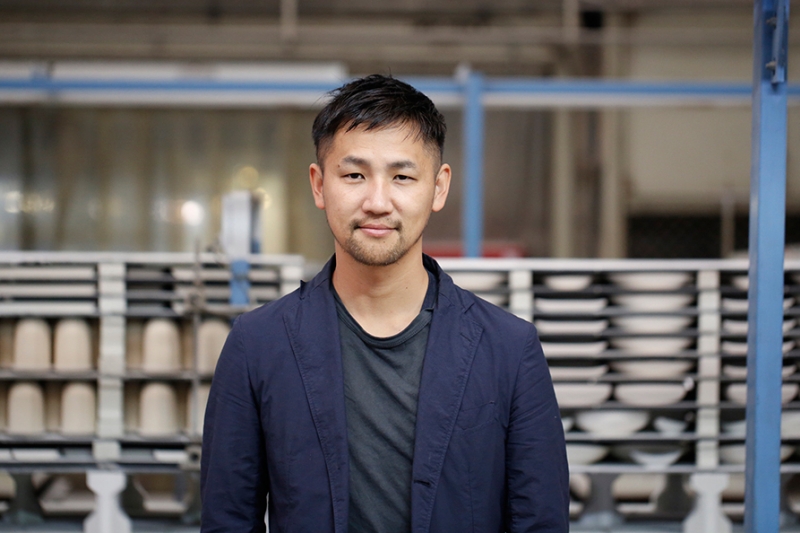
Interview: Shigeki Fujishiro
Shigeki Fujishiro Tokyo-based designer, Shigeki Fujishiro worked at acclaimed design studio IDEE before establishing his own practice in 2005. Since then he has produced an array of product designs including furniture, footwear and accessories. His collection for 2016/ is his very first experience of working in ceramic. Here he tells us about his ambitions and overcoming the technical difficulties of producing porcelain.
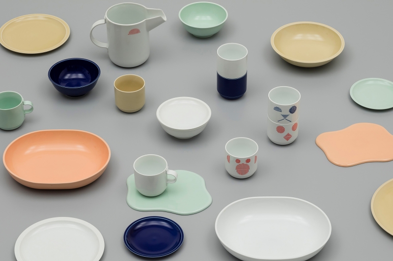
- Amongst the kitchen tools in your collection for 2016/ there are some less expected items; a soy sauce bottle and grater in particular, why did you choose those items?
Pieces from the 2016/ collections are intended to appeal to an international and a Japanese market. Teruhiro Yanagihara, the Creative Director of 2016/, and myself are the only Japanese designers participating in the 2016/ project and so I was asked to pay particular attention to items that might be suitable for the Japanese consumer.
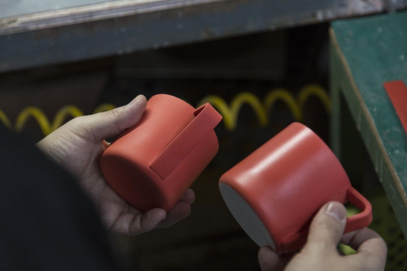
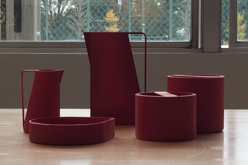
- The red glaze you have used is impressive. It has a very different aesthetic from what we might consider traditional porcelain, was that your intention?
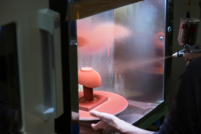
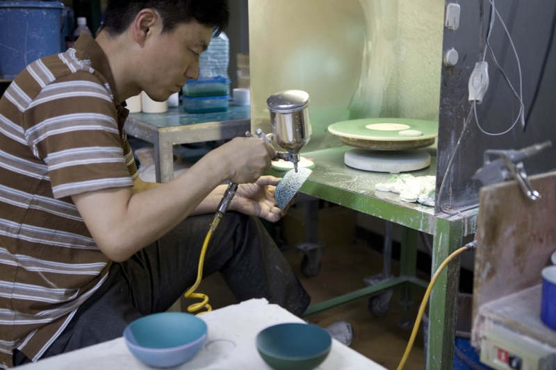
Actually, Akae (red painting) is a traditional and iconic technique in Aritaware. It was once used on pots, vessels and by a variety of potteries. In the past, only a portion of an object would be decorated with the red glaze. As a point of difference I chose to cover the whole object. The matte red finish I wanted was not easy to achieve however.
- Why did you insist on the matte red texture?
Because a glossy texture would have caused reflections in the surface of the items and I felt this would be a distraction. In other words, the matte surface shows off the beautiful forms best. A gloss finish is perhaps most associated with porcelain, but for me the pure form was much more important to emphasise.
- You made quite a few models during your design process didn't you?
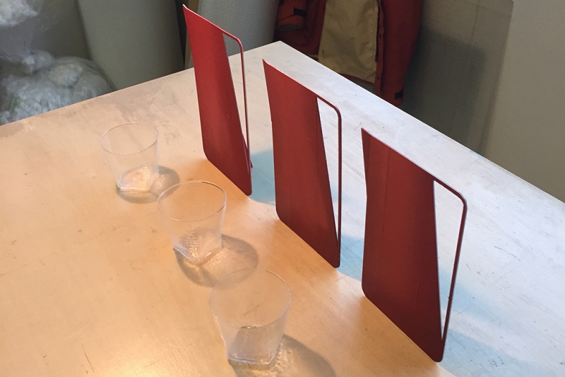
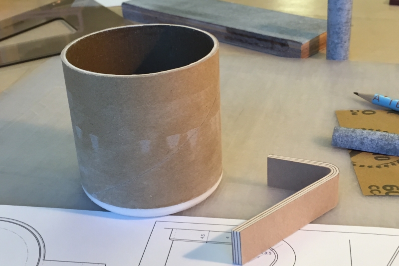
I worked on details of the forms, such as the thickness of the handle for example, over and over using paper models. I had to adapt the shape of the handle for the pitcher until we found the correct thickness to bear the weight of the porcelain vessel. In addition, we found that a thin handle would be easily deformed in the kiln. Throughout the design process I wanted to explore forms by creating models with my own hands – I don’t use a 3D printer in my work.
- This was your first project with porcelain. What were the most difficult aspects?
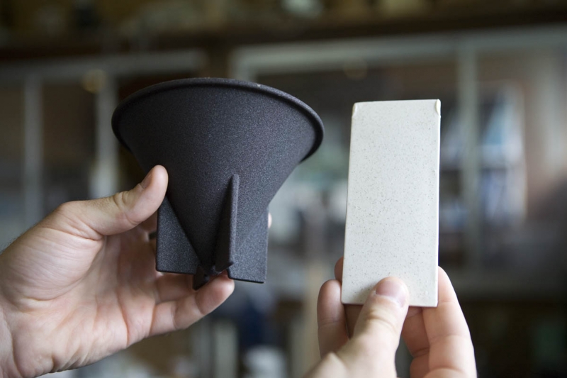
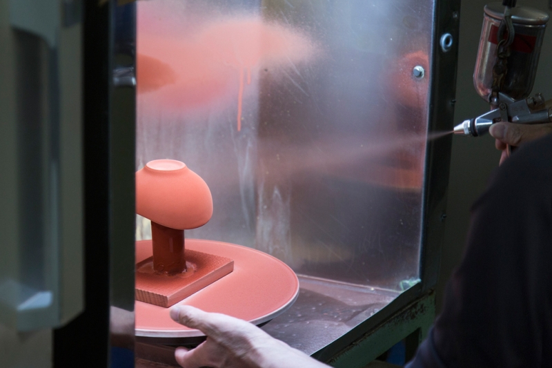
Realising the coloured glaze was a struggle. Unlike a painter mixing paint on the palette, producing a coloured glaze is more like a blind chemistry experiment. The red glaze only becomes red after firing; it’s not red when it is applied as a liquid. The transformation, a chemical reaction, happens in the kiln at 1200 ℃. Then, in terms of the form making, we were plagued by differences in the shrinkage of the clay. I tried to work with forms that were familiar to any home table; simple squares and circles, but shrinkage differs depending on the thickness of the clay, which meant it was difficult to achieve the forms I had modeled. For example, the circular part of the grater is angled and therefore the thickness of the clay at the top and bottom is different, meaning it does not shrink uniformly and you cannot be certain of the final form.
- Did you come across some of these problems because it was your first encounter with this complex process?
Exactly. When you have experience in porcelain design, your proposals are more likely to be within the framework of possible colour and form. I didn’t have that knowledge. But, I was able to think freely and that did allow me to suggest designs that are unprecedented in Aritaware. An experienced potter might have frowned and said "such color and form is technically impossible," but I believe that bringing the previously impossible to fruition and challenging the status quo is an important aim of 2016/ .