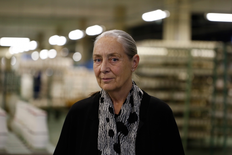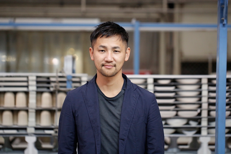
Interview: TAF
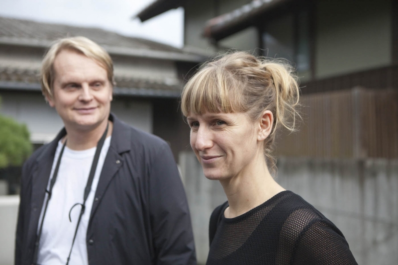
TAF Gabriella Gustafson and Mattias Ståhlbom of TAF are based in Stockholm, Sweden. Together they designs products, interiors and exhibitions, to be integrated into society. TAF have created a series of porcelain for 2016/ that is designed to appeal to children and adults alike. Here, Mattias Ståhlbom explains their ambition to make a collection that has a double use and that will stay around long after the kids have grown up.
- Is porcelain a new material for TAF? Have you worked with it before?
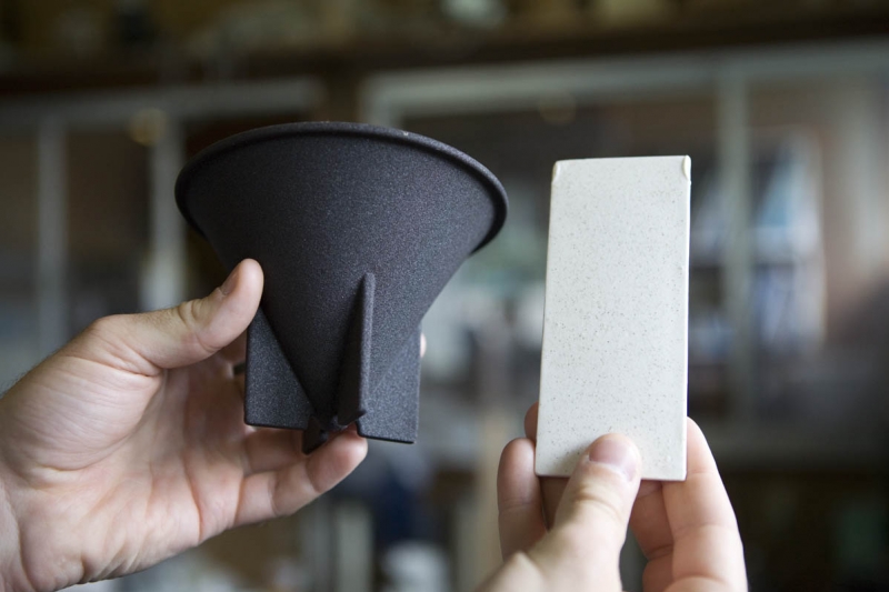
No, never. So we were thankful for the rich background we were given when we went to Arita. We learnt all about the material and the porcelain industry in Japan in general. It was really good, very thorough. We love working with different materials but we tend to first find a concept and then explore the materials to make it. So porcelain wasn’t something we had considered before but we found it a really cool and fascinating material.
- How did you approach the project, when did your idea for the design first emerge?
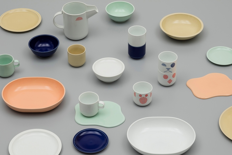
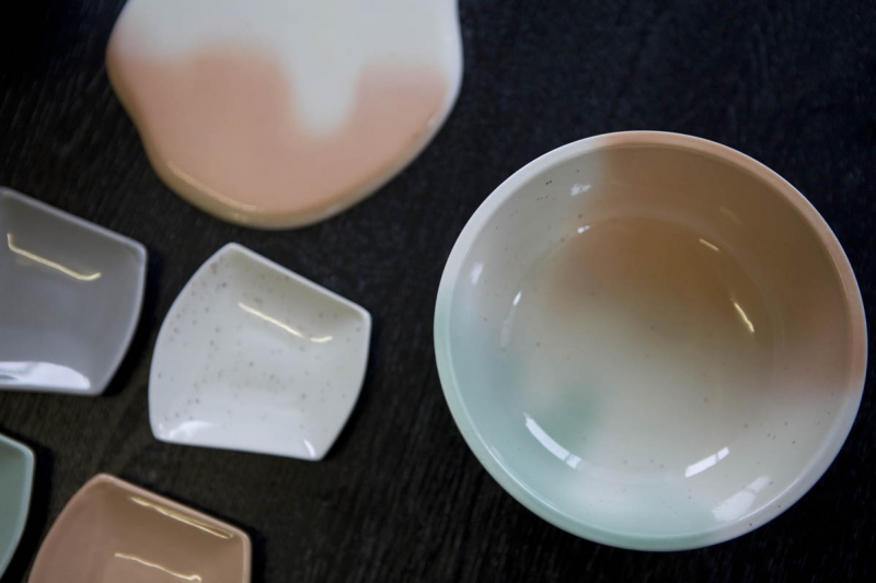
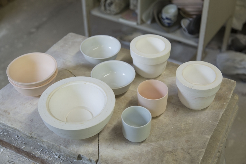
Initially we spoke about a series of porcelain especially for kids. But we felt there shouldn't be such a clear distinction between porcelain for adults and children, that there was opportunity for the same thing to be used by both. We wanted to make something that was appealing to children, but also applicable and functional for adults. We thought the series should have longevity and be ‘lifelong’ rather than becoming useless after a number of years. Children would be taken seriously and learn to use ‘real’, well-made tableware. So we started working with designs that had a naivety to them but were not childish. The pieces adapt to different uses too – for example, a full size plate for a kids meal can later be used as a saucer for a sandwich for grown-ups. We also thought about the duality between Western (or, Scandinavian) and Japanese ways of using tableware. When it comes to proportions, at least, there are differences.
- How did you give the porcelain a naive quality?
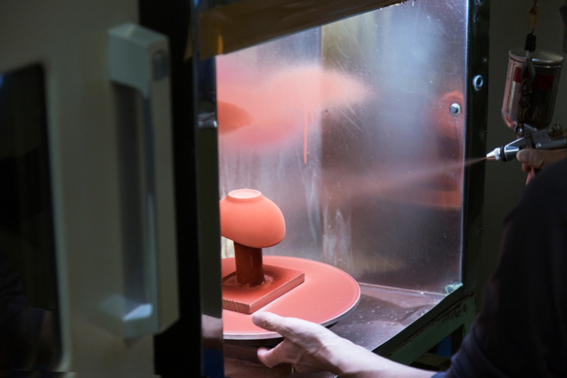
We worked with colours, patterns and graphics. And then we were also quite taken with this idea of kids spilling things and experimented with lots of materials such as milk and ice cream and those shapes informed a plate in the collection. It is a playful element. Our colour palette came from these experiments too, we picked apricot, vanilla and pistachio, and we tried to find a glaze that replicates the look of liquid porcelain.
- What about the other shapes, do they have a significance too?
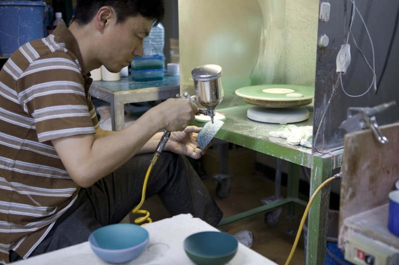
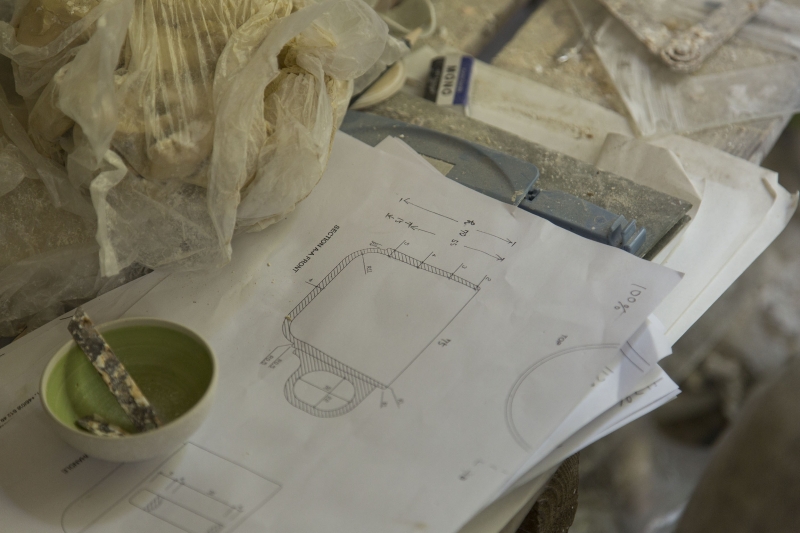
There were lots of functions that we needed to consider. This is everyday porcelain so aspects like stackability were important for example. We also became very interested in the shapes of some everyday objects; first of all the standard canteen cups that everyone has – we thought that as Arita produces the best quality porcelain in the world we could do something very interesting with this everyday shape and proportion. We also found a jug in Arita that was used in the workshop to pour clay into the moulds. We thought this functional item was so beautiful, it comes directly from the porcelain-making industry and is also something to do with pouring and spilling and the liquid quality of porcelain clay, so we also incorporated its shape into our collection.
- How did the collaboration with your pottery; Tokunaga, work? Were there specialist techniques and skills that they brought to the project?
The factory that we worked with specialises in applying decoration through stamps (the resulting patterns appear like two dimensional tattoos) so we experimented with that in our designs. We decided that geometrics were very grown up, too strict, and so we created some cute face patterns. We wanted to make a relief out of the patterns and that was super hard to accomplish. We made our early sketches for the patterns in a blue ballpoint pen and then were excited to see that the classic Arita blue glaze that has been used for decoration for hundreds of years looked exactly the same. This was another connection to the ‘double’ nature of the collection. Tokunaga were great to work with.
-How does the collection reflect how you work as a design practice?
This has been a typical project when it comes to our processes and how we work but as a project in a broader sense it is really not at all usual. It has been so interesting to see the social aspect of 2016/ and the way that many companies have worked together. I think it is really beautiful. We noticed that even people in the village who did not know each other before, now they drink beer together. The project is good in so many ways; it will give the area new work opportunities, keep all the knowledge about the process of making porcelain there for the future, and give the region the self-confidence it deserves. This project has meant so much on so many levels.
Portrait Photo by Anneke Hymmen